Chutzpa!
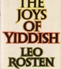
One of my favourite words is chutzpa! I think it always needs to be followed by an exclamation mark, don’t you? My well-thumbed Joys of Yiddish by Leo Rosten defines chutzpa! as gall, brazen nerve, effrontery, and incredible guts. A classic illustration of chutzpa! is that quality enshrined in a man who, having killed his mother and father, throws […]
Kerning vs. Tracking

Kerning in the digital world is the addition or reduction of space between a pair of characters to improve the overall balance and consistency of the spacing. Most well-designed typefaces include kerning pairs so that the type is beautifully set without too much additional work on the part of the designer. Tracking is the addition or […]
Solidus vs. Fraction Bar

The solidus (known as a slash and many other names) is an oblique stroke going from upper right to lower left, occasionally extending slightly below the baseline. It was formerly written to separate shillings from pence, and now used in numerical dates as in 1/25/58, as a substitute for a conjunction such as in East/West, and ratios. We […]
Character vs. Glyph
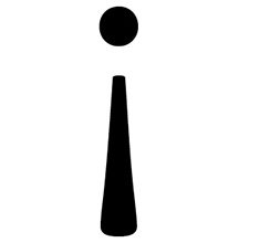
Typographic terminology is sometimes very specific and can be very confusing – even for seasoned designers. A character is the symbol representing an individual letter, numeral, punctuation, sign, symbol, accent, or other elements in a typeface. A glyph is the actual representation of that character. Several glyphs may represent one character as in this example.
Summer colour

Our garden has been a colourful delight of late – a welcome change from our cold, wet and grey spring. I’ve always been intrigued with the evocative names that are used to describe a particular colour. This love affair with language, colour, and design, first started when I was a teenager after I saw the captivating Winsor & Newton ink packaging. I […]
The art of book typesetting

I fell in love with typography as a student at NSCAD University. Amongst other subjects, I learned to set metal type – the smell of ink transports me back to the days I spent labouring over my galleys in the basement of the design division. During my 30+ years as a graphic designer, I’ve worked on […]
Graphic Design Case Study 1

Client: Femmes Équité Atlantique Book details: 6″ x 9″, approximately 200 pages each of three books, over 300 illustrations, wire bound, each book has a unique cover and appendix Poster details: 9″ x 17″, three different posters Website: 8 page custom website Services: graphic design and concept, layout and typesetting, custom illustration, website design and […]
Summertime reading book list
If you want to learn more about typefaces, graphic design and embrace your inner font nerd, here is a short book list to get you started: Just My Type by Simon Garfield. Find out how Helvetica and Comic Sans took over the world. Branding with Type, EM Ginger editor. This book will entertain and remind you […]
Helvetica – the Movie

If you want a great summer movie, watch Helvetica, the documentary about typography, graphic design, and global visual culture. I assure you, even if you are not a graphic designer, you will have your eyes opened by this film.
Script Fonts
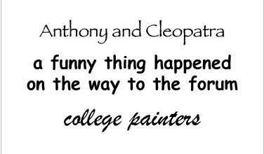
I recently reread Homer’s Odyssey and was intrigued to find out that the first printed edition, issued in Florence in 1488, was composed in type that imitated contemporary Greek handwriting, with all its complicated ligatures and abbreviations. Early printers tried to make their books look like handwritten manuscripts because printed books were regarded as vulgar and inferior […]
