


In September, I saw Keith Brown’s magic show at the Halifax Fringe Festival. It must have been my bright polka dotted t-shirt that made him point and ask me to come on stage along with other audience members – we were to help with one of his magic tricks. He asked a few questions of each participant – the first being, “What is your favourite colour?” I just went blank – how could I pick just one???
I have a favourite pair of lapis lazuli earrings but wouldn’t want my kitchen painted that intense colour of ultramarine. My company orange is Pantone 172 which Pantone calls warm red. Colour displayed on a monitor is RGB (red, green, blue) while printed colour is CMYK (cyan, magenta, yellow, black) – the same colour will appear differently on screen and in print. All of these thoughts ran through my mind – colour can get very complicated when you are a designer.
I think I muttered, “Turquoise … turquoise! That’s my favourite colour!” For now…
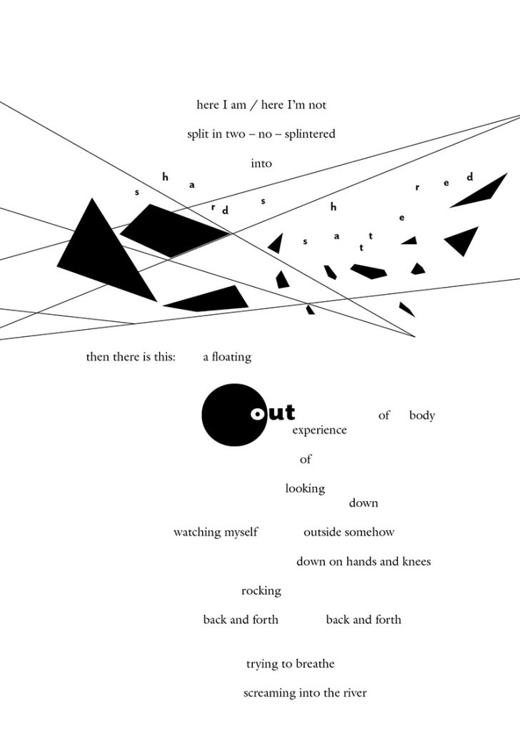
I loved working on this new book of poetry by Sheree Fitch (Nimbus Publishing) even though the poems describe excruciating grief and loss. The manuscript came to me with a few notations on where the author wanted the words to be set larger, bolder, or be somewhat illustrative – the rest was up to me on how to visually interpret the poems. The author was very pleased with the outcome – I was very happy that I could help bring her words to a greater audience.
When I was young, my mum subscribed to the Time Life Foods of the World series – a new cookbook would arrive every six weeks or so. I’d pore over the book and accompanying spiral-bound recipe booklet, imagining what new recipes we could make. We would hunt for the “exotic” ingredients now commonly found in grocery stores – hoisin sauce, filo pastry (we watched it being made by hand), pomegranate syrup, tahini. We made the gingerbread house on the cover of the Cooking of Germany cookbook, Scandinavian gravlax, cabbage rolls from American Melting Pot, and other delicious recipes – many, I still use today.
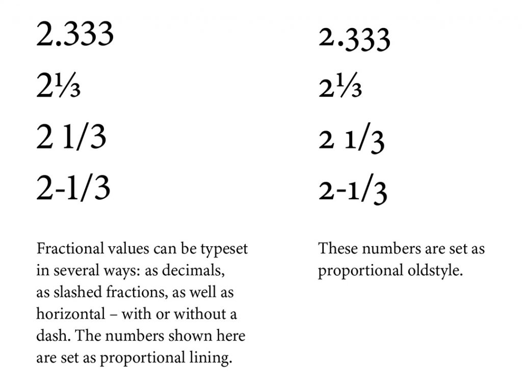
Those early experiences fostered my love of cooking, reading and design. I’m working on a new cookbook – all about cooking with herbs – for Fitzhenry & Whiteside. There are many considerations when designing a cookbook – fonts, colours, photos and illustrations, how the book will be used, how to list the ingredients, what type of fractions to use, and where to put the serving size … just for a start.
Designing and laying out cookbooks is finicky and demanding – ah, but at least I can drool over the recipes while I’m working.
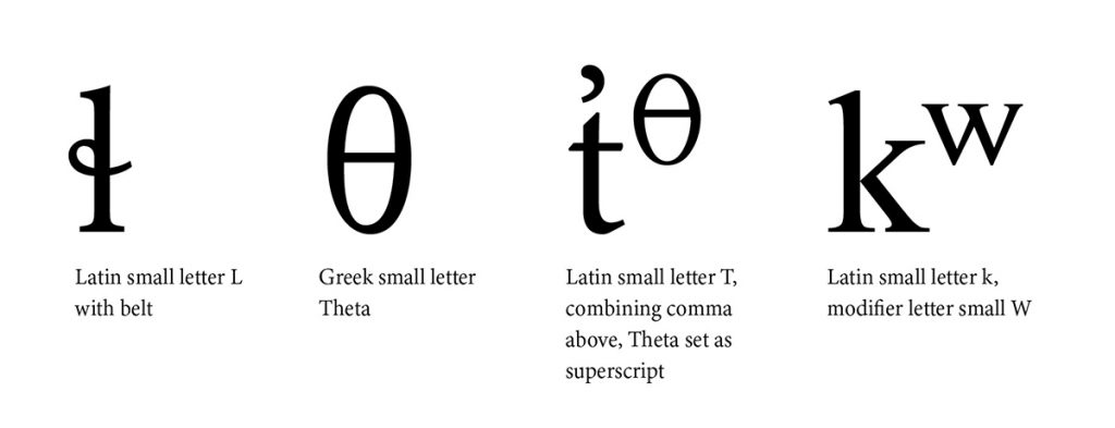
I recently had a challenging book project for MQUP that included typesetting the language of the Musqueam people – the oldest-known residents of Vancouver. It is written using the Americanist phonetic notation and has 36 consonants, 22 of which are not found in English. Using Minion 3 and First Nations Unicode fonts, I was able to set all the necessary glyphs. Note that even at the beginning of a sentence, hәn̓q̓әmin̓әm̓ uses no upper case letters. e. e. cummings would have loved the language.
I love to design books, especially ones that have anything to do with food. Cookbook design can be challenging: making sure fractions are set correctly, use of metric and/or imperial measures, ingredient lists, instructions, and recipe yields, to name a few.
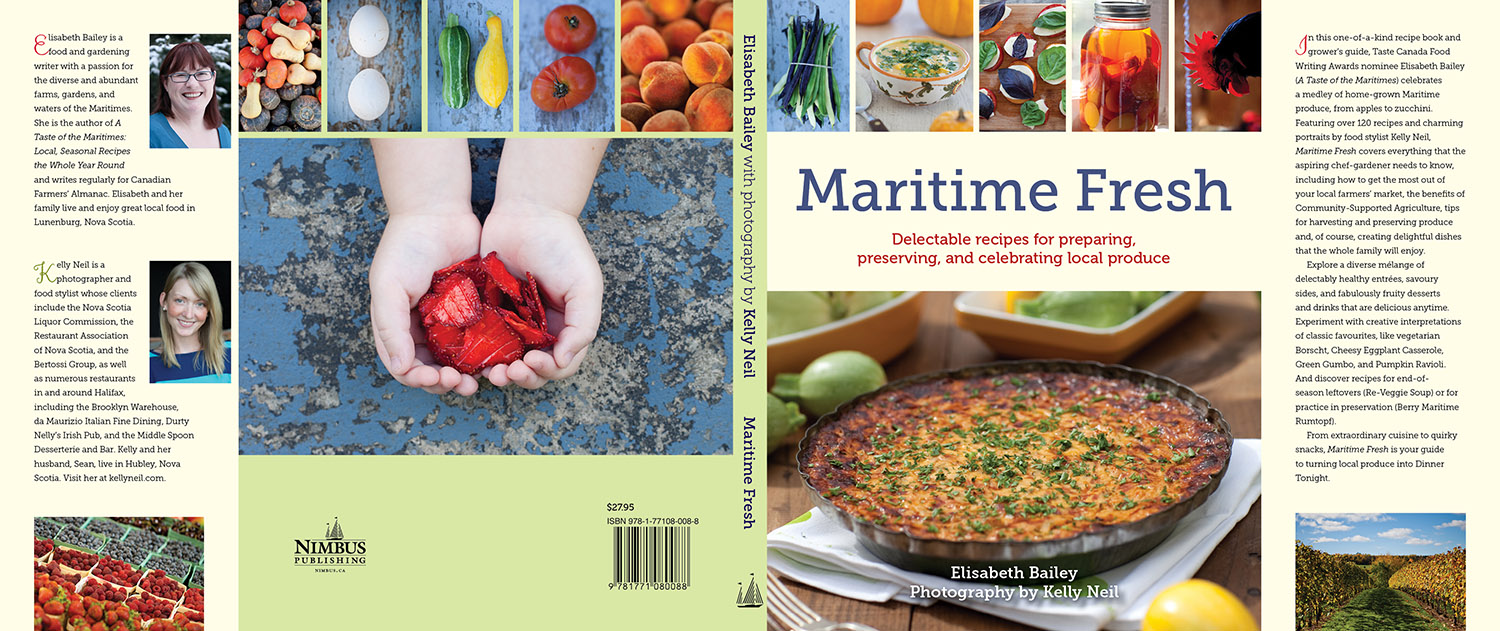
Maritime Fresh (Nimbus) by Elizabeth Bailey with photos by Kelly Neil, was a mouth-watering delight to work on. The recipe for Maple Squash Muffins is perfect for using up left-over pumpkin or squash.

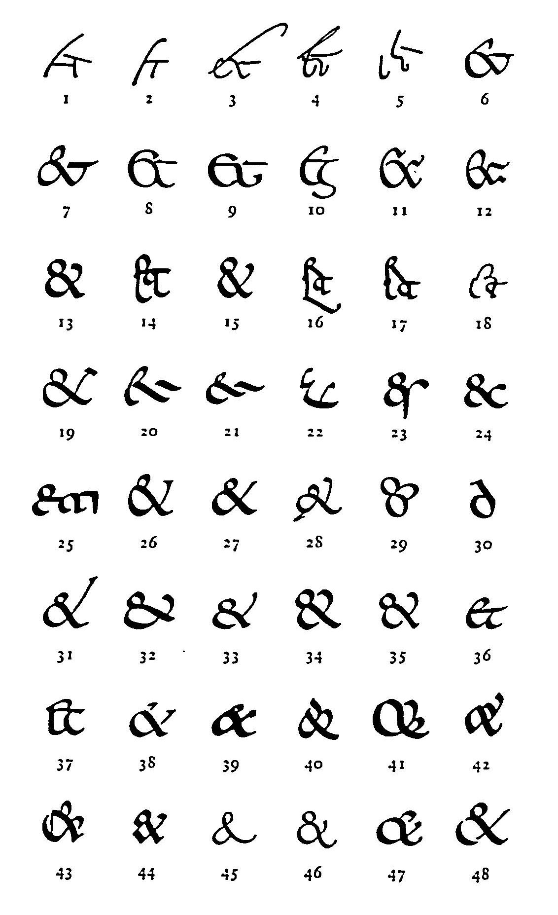
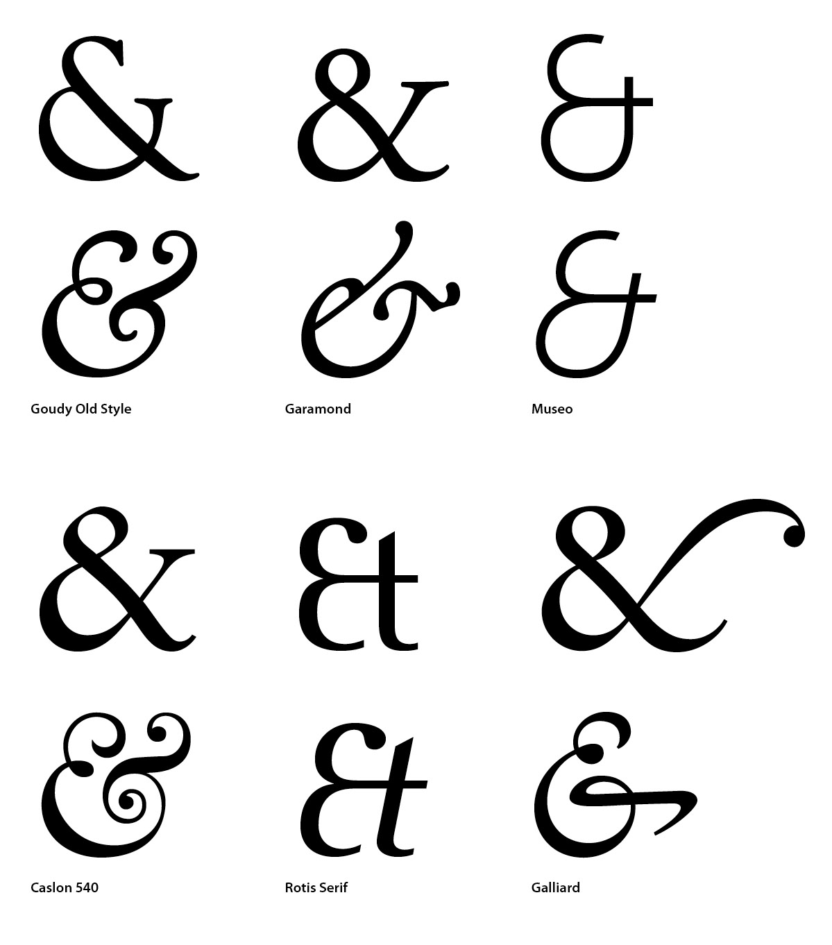
I’m not sure when I first fell in love with the ampersand. Probably when studying visual communications at NSCAD University when I hand painted letters using ink and brush, along with a lot of white paint to fix errors.
The ampersand began as the Latin word “et” meaning “and.” This 1st century ligature evolved into what we now know as the delightful ampersand.
You can delve more into the history of the ampersand in Jan Tschichold’s masterly book Formenwandlungen der &-Zeiche and Keith Houston’s Shady Characters.
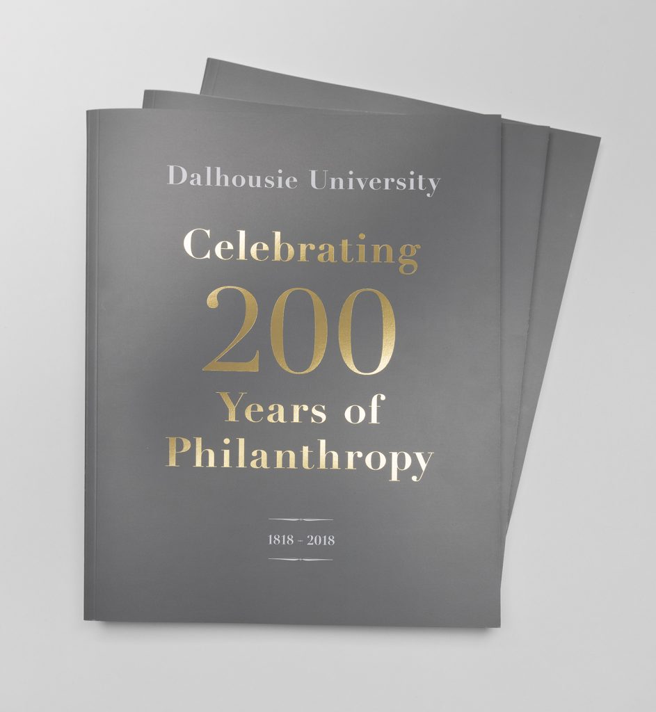
I was thrilled when Dalhousie University asked me to work on their publication over a year ago. Working closely with the staff in their Office of Advancement, we developed the theme for their 200th anniversary report – a thank-you to the many donors who have impacted the lives of students, faculty and researchers. The publication keeps within the Dal branding standards but is a unique design piece. Gold foil on the covers gives a unique feel and echoes the brand colour.
Existing photography came from many different sources, old and new. All were colour corrected and adjusted to give visual continuity. New photography was commissioned to highlight specific donors and some of their precious Dalhousie momentos. Working with Bob Young, we created studio “still lives” that gave a visual nod to the past.
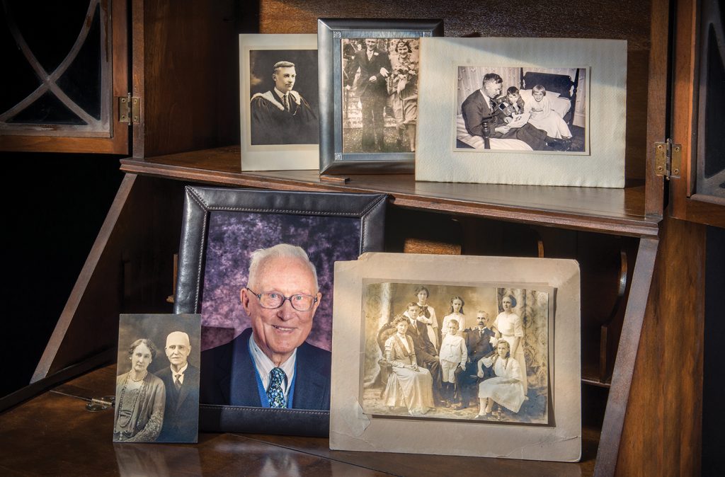
The Creighton family has a rich history with Dal that dates back nearly 200 years. ©Robert George Young

Rod’s Dalhousie graduation photo from 1960, along with his curling sweater from his student athlete days, and the A. Gordon Archibald Award, received from the Dalhousie Alumni Association in 2000. © Robert George Young
Watch photo © Robert George Young
Photo of Rod © Kelly Clark
© Robert George Young
Just some of the steps that went into the design process:
- client meetings
- review existing brand standards
- develop design criteria
- initial design mock-ups
- review initial draft copy
- hire copy editor
- refinement of design & layout
- hire photographers
- gather existing photography & retouch
- organize photo shoots
- art direction at photo shoots
- gather artifacts
- art direction of studio photo sessions
- develop print specifications for tender
- consult with awarded printer
- final layout of 54 page publication
- gather edits from client & copy editor
- input edits
- repeat all of the above until perfect
Please contact me if you’d like me to send you a copy of the printed book.
We are off to southern Spain in a few weeks and I have been pouring over my stack of guide and hiking books. The Rough Guide to Andalucía is comprehensive at over 600 pages. My main complaint is that many of the maps are not orientated with the north arrow pointing up. The publishers do this to save valuable space, but I find it extremely awkward. Another annoyance is the use of very small, very thin, sans serif type set in one wide column – and yes, I’m wearing my glasses when reading.
The Lonely Planet Andalucía is more concise at 400 pages and leaves out some of the smaller towns and sites that we will be visiting. It is much more legible, the map north arrow is pointing up and it is typeset in two easy-to-read columns.
Now, if could only redesign the two books into one, I’d be one very happy guide book enthusiast.
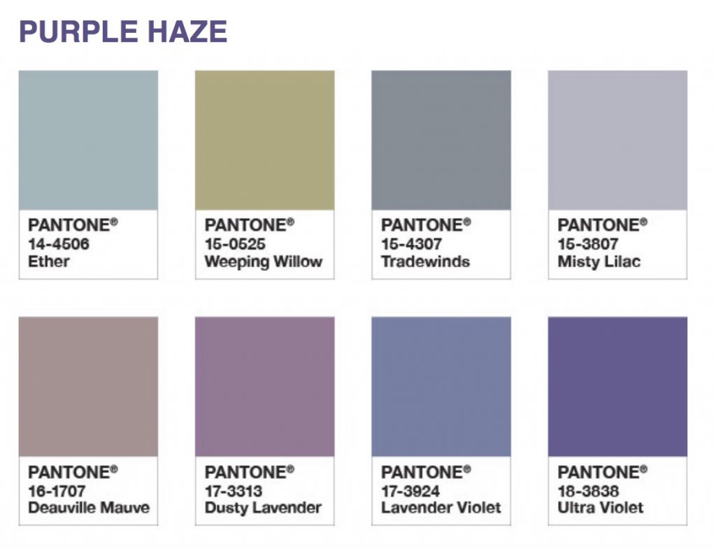
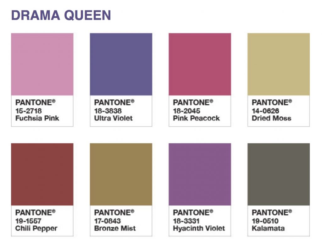
“We are living in a time that requires inventiveness and imagination,” says Leatrice Eiseman, Executive Director of the Pantone Color Institute when speaking about Ultra Violet – Pantone’s Color of the Year 2018. She goes on to say, “From exploring new technologies and the greater galaxy, to artistic expression and spiritual reflection, intuitive Ultra Violet lights the way to what is yet to come.”
The eight new colour palettes that feature Ultra Violet are a welcome reprieve, especially on these grey March days. The jewel-like Drama Queen is one of my favourites. The ethereal Purple Haze is calmer and I’ve used it with success in a new publication about botanical illustration.
I love reading novels. Rarely is there a reference to printing and/or typography. I was delighted to read this from Conceit by Mary Novik,
“But Pegge listened. She could hear the bodies decomposing under her feet in the privacy of tombs. Her hearing was acute, able to pick out threads of silence, like the sub-human sounds of worms extruding casts or like the silent descenders in a printer’s font.”
A descender, rarely silent, is any part of a lowercase letter that extends below the baseline, found for example in g, j, p, q, etc.
You can find out more about typeface anatomy at FontShop.