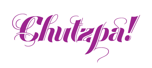
One of my favourite words is chutzpa! I think it always needs to be followed by an exclamation mark, don’t you?
My well-thumbed Joys of Yiddish by Leo Rosten defines chutzpa! as gall, brazen nerve, effrontery, and incredible guts. A classic illustration of chutzpa! is that quality enshrined in a man who, having killed his mother and father, throws himself on the mercy of the court because he is an orphan. Shown here set in Festival Pro Script.
Kerning in the digital world is the addition or reduction of space between a pair of characters to improve the overall balance and consistency of the spacing. Most well-designed typefaces include kerning pairs so that the type is beautifully set without too much additional work on the part of the designer.
Tracking is the addition or reduction of spacing between a whole range of characters. This can be used to improve the overall spacing of a font at a particular size, or to create the appearance of a more open, letterspaced look, usually reserved for short all-cap headings. Many running heads in books are set in all caps with extra tracking added.
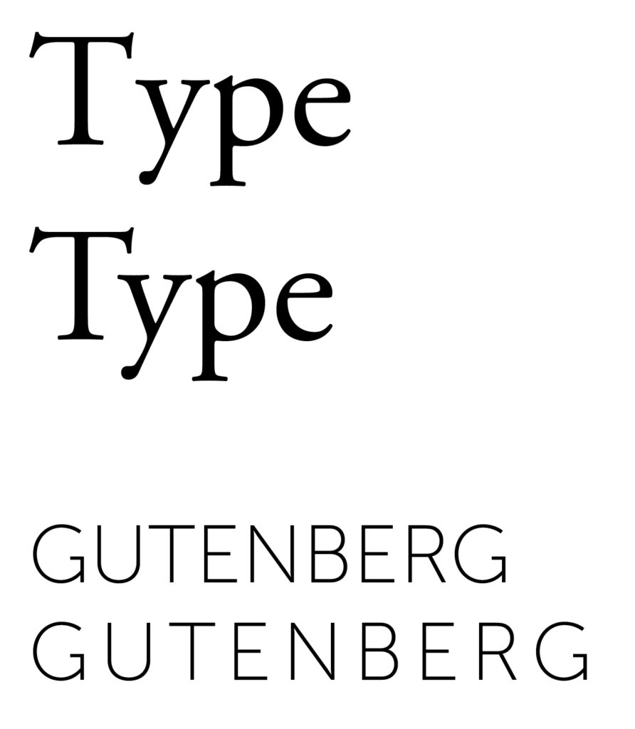
Top: Kerning – note the space between the T and Y. The second line is the correct way to set type. Bottom: Tracking – space has been added universally around all the characters of the word.
The solidus (known as a slash and many other names) is an oblique stroke going from upper right to lower left, occasionally extending slightly below the baseline. It was formerly written to separate shillings from pence, and now used in numerical dates as in 1/25/58, as a substitute for a conjunction such as in East/West, and ratios. We also have the reverse solidus, known as the backslash.
The fraction bar is also a diagonal line, but it is on a more extreme angle, and extends from the cap height to the baseline. It is designed specifically for diagonal fractions, and thus its width and weight is sensitive to each typeface design. Most Pro typefaces have the standard set of fractions – ½ ¼ ¾ ⅓ ⅔ ⅛ ⅜ ⅝ ⅞. Many typefaces only have a few fraction glyphs (see previous post) and thus the fraction will have to be made up of a superscript number, a fraction bar, and a subscript number. These will need to also be adjusted so that the spacing is correct.
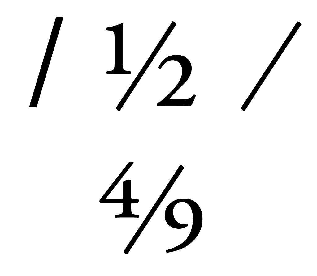
Top row: the solidus, fraction glyph, and fraction bar. Bottom row: a fraction set with a numerator, fraction bar, and denominator.
Typographic terminology is sometimes very specific and can be very confusing – even for seasoned designers.
A character is the symbol representing an individual letter, numeral, punctuation, sign, symbol, accent, or other elements in a typeface.
A glyph is the actual representation of that character. Several glyphs may represent one character as in this example.
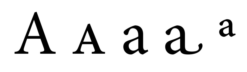
The letter “a” is represented by these four glyphs: upper case, true small cap, lower case, lower case swash alternate, and superscript a.
Our garden has been a colourful delight of late – a welcome change from our cold, wet and grey spring.
I’ve always been intrigued with the evocative names that are used to describe a particular colour. This love affair with language, colour, and design, first started when I was a teenager after I saw the captivating Winsor & Newton ink packaging. I was smitten! How clever to use a spider on their bottle of Black Indian Ink – so named as black ink has been in use in India since at least the 4th century BCE. And a cute squirrel on their bottle of Burnt Sienna – named for the clay Tuscan soil that surrounds the town of Siena.
Many colour names are derived from flowers and fruit of the same name: lemon, orange, rose, plum, honeydew, raspberry, peach, bittersweet, mustard, and pink. The colour pink is named after the flowers called pinks (Dianthus). The name derives from the frilled edge of the flowers – like pinking shears that create a zig-zagged line when cutting cloth.
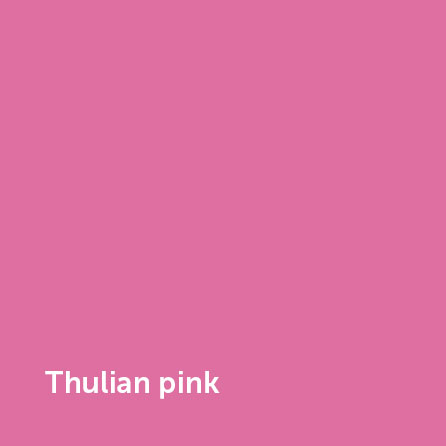
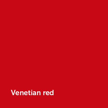
Some colour names are derived from historical events or locations: British Racing Green, Thulian Pink, Venetian Red, and Eton Blue.
I hope your summer is colourful with lots of time to catch up on reading while sipping some pink lemonade.
I fell in love with typography as a student at NSCAD University. Amongst other subjects, I learned to set metal type – the smell of ink transports me back to the days I spent labouring over my galleys in the basement of the design division.
During my 30+ years as a graphic designer, I’ve worked on many books for publishers in the UK & Canada. I’ve designed and typeset cookbooks, novels, academic textbooks, guidebooks, art books, how-to books, poetry, biographies, children’s books, journals, young adult & history books. Working on these projects allows me to delve into the minutiae of type and handle all the little details that make for a beautiful book.
What does a book typesetter do? We set type! What does this mean?
A typical project could consist of the following (after initial design layout has been approved by the publisher):
- receive Microsoft Word file from publisher
- fix Word file
- make sure notes are either endnotes or footnotes
- fix ellipses to true ellipses (not three periods)
- change hyphens to en or em dashes, with or without spaces depending on publisher’s house style
- delete double spaces at end of sentences
- ensure end punctuation is inside or outside of quotation marks depending on UK or Canadian style
- remove empty paragraph returns and tabs
- remove space at start of paragraphs
- set true small caps
- set fractions as true fractions: ½ not 1/2
- set true curly quotes
- set non-breaking spaces so you don’t have “see p. 18” with the “p.” on one line and the 18 on the following line
- set up master pages including appropriate running feet and folios
- apply paragraph and character styles, using nested styles, GREP styles, etc
- fix widows & orphans
- fix kerning issues
- make nice rags
- fix loose and tight lines
- eliminate ladders, rivers & runts
- fix bad hypenation
- set tables
- set captions
- set table of contents & index
- make revisions & edits after first pages are sent back from the publisher, repeat as necessary
Here is a before and after example from the guidebook Edinburgh Celebrity City Guide
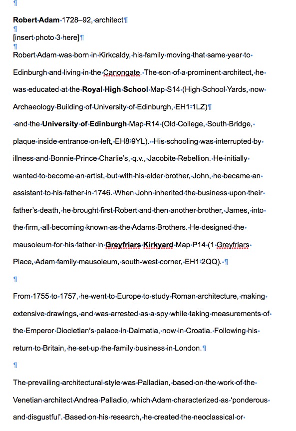
Word file
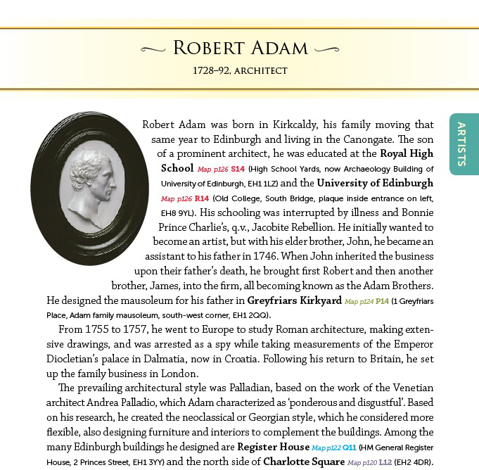
Formatted text
As you can see, a book typesetter spends a lot of time finessing the original manuscript into legible and readable type. Great typesetting is when no one notices it and only sees (and reads!) a beautiful book.
Client: Femmes Équité Atlantique
Book details: 6″ x 9″, approximately 200 pages each of three books, over 300 illustrations, wire bound, each book has a unique cover and appendix
Poster details: 9″ x 17″, three different posters
Website: 8 page custom website
Services: graphic design and concept, layout and typesetting, custom illustration, website design and development
The Femmes Équité Atlantique (FÉA) was made up of organizations that dealt with women’s issues in the four Atlantic Provinces, and was created in 2004. FÉA’s mandate was to improve the socio-economic situation of Acadian and French women in the Atlantic provinces. Sadly, this organization is no longer active due to government cut-backs.
The client came to me after they had hired a graphic design company to produce their publications. The books were almost completed but the client wasn’t happy with the process and final work. At the eleventh hour, they decided to seek another design firm to salvage the project. I met with the client and understood that this project needed a designer who would make significant contributions to the project. Someone who would not just take the manuscript and slap it on a page.
The three resource books were used as hands-on workbooks for young girls and women in the Acadian and French populations in New Brunswick, PEI, and Newfoundland. Each book consists of core pages with specific appendices for each province. A book for Nova Scotia was not produced due to political reasons. Three posters were also produced and subsequently a website for the organization that we designed.
The client was thrilled to work with a designer who could translate their vision into books that would appeal to their target audience. Filled with lots of fun drawings, bright colours, side bars, icons, and diary-type pages, the books were sought out by individuals and the client was happy to do a second print run. Sensitivity was necessary as the subject matter ie: sexual assault, was at times difficult.
An added bonus for my client was that I speak French and understand specific French typographic constraints, and dealing with French manuscripts wasn’t intimidating to me.
Client said: “Peggy nous a été de bon conseil lors de la création de notre site Internet. Il est facile à naviguer, accueillant et professionnel!” Translates to “Peggy gave us great direction during the creation of our internet site. It is easy to navigate, accommodating and professional!

If you want to learn more about typefaces, graphic design and embrace your inner font nerd, here is a short book list to get you started:
- Just My Type by Simon Garfield. Find out how Helvetica and Comic Sans took over the world.
- Branding with Type, EM Ginger editor. This book will entertain and remind you of the most profound 500-year-old business lesson around: type sells.
- Stop Stealing Sheep by Erik Spiekermann & EM Ginger. This best seller since 1993 will show how type is used as a powerful communications tool.
- The Elements of Typographic Style by Robert Bringhurst. My signed, well-thumbed copy is my go-to reference book for typographic style. It offers a deeper appreciation of letters and what they mean.
- Shady Characters by Keith Houston. I’ve just started this book about symbols and the stories behind them. I’ll find out why the @ symbol is called a strudel in Hebrew and a rollmop herring in Czech. OK, I’ve just confirmed that I am a font nerd.
If you want a great summer movie, watch Helvetica, the documentary about typography, graphic design, and global visual culture. I assure you, even if you are not a graphic designer, you will have your eyes opened by this film.
I recently reread Homer’s Odyssey and was intrigued to find out that the first printed edition, issued in Florence in 1488, was composed in type that imitated contemporary Greek handwriting, with all its complicated ligatures and abbreviations. Early printers tried to make their books look like handwritten manuscripts because printed books were regarded as vulgar and inferior products. Just as today, we often regard cheap paperbacks as inferior to hardcover books.
Over the past few years, I’ve seen a greater usage of script fonts, with some wonderful new ones to choose from. A script can add flair, distinctiveness, and personality to a project. Scripts can be a great choice for invitations and announcements, greeting cards, and book covers. Choosing the best script font can be challenging.
- Don’t use Papyrus just because your topic is ancient in some way, especially if it’s about Ancient Egypt. (Better yet, don’t use Papyrus at all)
- Don’t use Comic Sans just because your topic is humorous. (Better yet, don’t use Comic Sans at all – see above)
- Don’t use Brush Script just because your topic is about painting.
Some of my favourite script fonts are:
- Festival Script Pro if you want some whimsy and movement while retaining legibility.
- Sweetgrass Script if you want to give an organic handmade look.
- Cocktail Script if you want a retro vibe going on while you sip on your icy martini.