Favourite colour?

In September, I saw Keith Brown’s magic show at the Halifax Fringe Festival. It must have been my bright polka dotted t-shirt that made him point and ask me to come on stage along with other audience members – we were to help with one of his magic tricks. He asked a few questions of each participant […]
You Won’t Always Be This Sad

I loved working on this new book of poetry by Sheree Fitch (Nimbus Publishing) even though the poems describe excruciating grief and loss. The manuscript came to me with a few notations on where the author wanted the words to be set larger, bolder, or be somewhat illustrative – the rest was up to me on how to visually interpret […]
Cookbook design

When I was young, my mum subscribed to the Time Life Foods of the World series – a new cookbook would arrive every six weeks or so. I’d pore over the book and accompanying spiral-bound recipe booklet, imagining what new recipes we could make. We would hunt for the “exotic” ingredients now commonly found in […]
Typesetting hәn̓q̓әmin̓әm̓

I recently had a challenging book project for MQUP that included typesetting the language of the Musqueam people – the oldest-known residents of Vancouver. It is written using the Americanist phonetic notation and has 36 consonants, 22 of which are not found in English. Using Minion 3 and First Nations Unicode fonts, I was able to set all the necessary glyphs. Note that even at […]
Cookbook typography

I love to design books, especially ones that have anything to do with food. Cookbook design can be challenging: making sure fractions are set correctly, use of metric and/or imperial measures, ingredient lists, instructions, and recipe yields, to name a few. Maritime Fresh (Nimbus) by Elizabeth Bailey with photos by Kelly Neil, was a mouth-watering delight to work on. […]
The 27th letter

I’m not sure when I first fell in love with the ampersand. Probably when studying visual communications at NSCAD University when I hand painted letters using ink and brush, along with a lot of white paint to fix errors. The ampersand began as the Latin word “et” meaning “and.” This 1st century ligature evolved into what we now know […]
Dalhousie University’s 200th Anniversary

I was thrilled when Dalhousie University asked me to work on their publication over a year ago. Working closely with the staff in their Office of Advancement, we developed the theme for their 200th anniversary report – a thank-you to the many donors who have impacted the lives of students, faculty and researchers. The publication keeps […]
¡Andalucía!

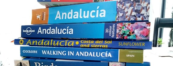
We are off to southern Spain in a few weeks and I have been pouring over my stack of guide and hiking books. The Rough Guide to Andalucía is comprehensive at over 600 pages. My main complaint is that many of the maps are not orientated with the north arrow pointing up. The publishers do this to […]
Pantone Color of the Year 2018

“We are living in a time that requires inventiveness and imagination,” says Leatrice Eiseman, Executive Director of the Pantone Color Institute when speaking about Ultra Violet – Pantone’s Color of the Year 2018. She goes on to say, “From exploring new technologies and the greater galaxy, to artistic expression and spiritual reflection, intuitive Ultra Violet lights the way to […]
Silent descenders

I love reading novels. Rarely is there a reference to printing and/or typography. I was delighted to read this from Conceit by Mary Novik, “But Pegge listened. She could hear the bodies decomposing under her feet in the privacy of tombs. Her hearing was acute, able to pick out threads of silence, like the sub-human […]


