


I love to travel, and I find the joy is in the planning and researching for the upcoming trip. I am a self-confessed guidebook junkie – I get as many as I can from the library to do the initial research and then decide on which to purchase. Easy.
As a graphic designer with one guidebook under my belt (Edinburgh: Celebrity City Guide), I am swayed not only by the contents, but how the book looks and functions. Are the margins wide enough or do I have to literally crack the spine to read the text in the inside gutter? Is it easy to find sections and sub-sections? Are the maps easy to read and can I find specific references to museums, historical building, and restaurants? Does the book have colour photos? What type of paper is used? Is the index useful? Typeface choice is particularly important when it comes to guide books and maps, as often there is a lot of content being squeezed into tiny spaces.
Enter Rick Steves – the author of many European travel guidebooks. His guidebooks have wonderful content – written in his candid humorous style. His maps unfortunately use a close relative to Comic Sans for all the map text. Comic Sans is classified as a casual, non-connecting script for use in informal documents inspired by comic book lettering. It has a childlike appearance and is often misused. I guess Rick wants to get across the idea that travelling is fun. But I shudder to think what a map of a European WWII site would look like all set in Comic Sans. Not so funny.
So, Rick, if you want me to purchase your travel guides, please change your typeface.
 I was recently in a jewelry shop and saw some dazzling rubies. The saleswoman referred to one ruby as a true red. What I saw was a deep magenta.
How we see colours can differ greatly from person to person, and how we name colours can also vary. I’ve always been fascinated by the evocative names of colours: jaw-breaking candy apple red, sooty coal black, fragrant wild strawberry, and the watery eau de nile.
So next time you see a beautiful ruby, you may want to refer to it’s colour as magenta, pink, light red, blood-red. Or just ruby red – it’s all up to you.
I would guess that most of you do not have colour calibrated monitors. So viewing a PDF on my screen will look different on your screen; sometimes very different.
How we see colour depends on many things. For photographers and designers, the primary difference is whether we are viewing printed colours (CMYK) or those on screen (RGB).
At Peggy & Co., we use the colour calibration system ColorMunki to ensure that what we are seeing on screen is as accurate as possible to what the final printed piece will be. No system is 100% due to the physics of light beams and ink, but we come awfully close.
We almost always get a printer’s proof prior to the job going on press to double check that all the colours (and fonts, etc.) are correct. Proofing systems have come a long way and ensure that what you sign off on will be what your final printed piece will look like.
If in doubt, our digital alchemist Bob Young would be more than happy to discuss with you how you can calibrate your monitor too.


We recently worked on a colourful project for Atlantic Central – the trade association that supports all of the credit unions in Nova Scotia, New Brunswick, Newfoundland and Labrador, and Prince Edward Island.
We designed this booklet to be used as an educational tool when Atlantic Central is speaking to governments. The criteria was that it had to be eye-catching and informative – something that stood out from the crowd. After drawing up a list of provincial icons, and discussing colours and styles, the cover illustration was drawn by Bonnie Ross. The circle theme was reinforced with copy by Margaret MacQuarrie and we used interesting facts and infographics throughout the booklet. The circle die-cut on the cover was a cost-effective way to achieve some wow – our printer had a number of existing dies – we picked the one that worked and saved our client hundreds of dollars.
And if you look closely, you may be able to spot some Marsala used too – there isn’t a colour that we never use.
What our client had to say…
“Atlantic Central was looking for a design partner to help us produce creative materials as part of our stakeholder engagement strategy. Peggy & Co. delivered a brochure that far exceeded our expectations and that positions us exactly as we need with key audiences. The process of working with Peggy from planning to design to execution was on-time, on-budget, and quite fun (and working with the excellent partners she brought to the table was seamless.)”

We all need a joyful boost of colour this time of year – something better than grey. But Marsala – Pantone Color of the Year 2015 doesn’t do it for me. I’ve loved some of the previous Pantone colours: honeysuckle, chili pepper, blue iris, turquoise, and tangerine tango.
The colour of Marsala wine is rich and deep and has been produced in Sicily since 1796. Served chilled it goes well with Parmesan, Gorgonzola, and Roquefort, or it can be served at room temperature as a desert wine. It is used in such iconic recipes such as chicken marsala and zabaglione.
“Nurturing and fulfilling, Marsala is a natural fit for the kitchen and dining room – making it ideal for tabletop, small appliances and linens throughout the home,” says Leatrice Eisenman (Executive Director, Pantone Color Institute). Maybe so, but for me, the Pantone Marsala reminds me of a metal paint primer.
Choosing, describing, and using colour can be challenging. We use spot Pantone colours and/or CMYK (cyan, magenta, yellow, black) inks for printing. Monitors use RGB (red, blue, green) light. We have societal influences for what we like and don’t like. In China, red indicates luck, while in Nigeria and Germany it means the exact opposite. And we are often influenced by experiences we have had as a child.
Send me an email – I’d love to hear what your favourite colour is. But more importantly, why.
![]()
I can’t quite believe it but I am now a Woman of Excellence. Yeah, you knew it, right? I’m very very honoured to receive this award from the amazing, tireless women at the Canadian Progress Club Halifax Cornwallis. Very honoured.
Our wonderful client Phoenix Youth nominated me, partially for the design work we have done over the last three years. And I guess because I’m such a swell gal. We have had a blast producing the annual donor reports and will continue to do so in the coming years. I image I’ll have to, now that I get to wear the tiara.
Over the past 25 years, the women with the Canadian Progress Club have raised over $1 million for Phoenix. All of our design, photography, and writing services have been donated as well. For us, it is a simple way to give back and help Phoenix get their message out to the community.
Please consider joining me at the gala event on November 19, 2014 in Halifax. Ticket proceeds go to Phoenix. I can’t say enough about the work that the staff and volunteers at Phoenix do for our youth. They literally change and save lives.
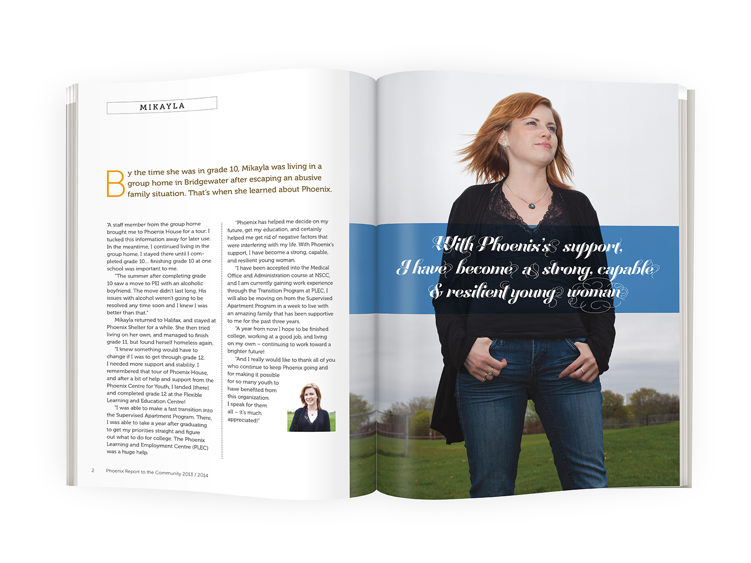
And heartfelt thanks to our amazing team for the 2014 Phoenix donor report: photographer Kelly Clark, wordperson Margaret MacQuarrie, digital alchemist Robert George Young, & the Minister of Belly Rubs Jack. Without you, well…. I’d be a girl without a crown.

As some of you know, my partner Robert George Young (Bob) is a photographer. He has been a stock photographer for over 30 years and has recently launched The Biophilia Project. The Biophilia hypothesis – a term first coined by Harvard professor Edward O. Wilson in his book Biophilia (1984) – suggests that we are all naturally drawn to, and benefit from, personal exposure to nature.
Bob has created a powerful series of large-scale photographs that capture unique views of nature – each piece a richly-coloured and riveting window to the natural world.
The Biophilia Project (www.biophiliaproject.com) blends his passionate, joyful obsession with nature with his professional mastery of specialized photo and software techniques. Under controlled conditions in his studio, he applies various techniques such as focus stacking and panorama stitching to integrate dozens to hundreds of photographs and create a single, finished work.
“One of photography’s greatest strengths as an artistic medium is its unparalleled ability to capture detail. This quality is, in part, what drives my work,” says Young.
Bob’s compositions serve to remind us of how we are a vital and integral part of our environment. A photograph of an oak leaf and a pheasant feather illuminates the striking similarities between these seemingly disparate elements. Repeating hydrangea petals reveal to the viewer the extraordinary in the ordinary.
Bob wants the viewer to “take a moment to ponder the architecture of a simple leaf – its line, form, texture and colour are as much art as it is nature.”
The Biophilia Project photos are printed and mounted with carefully selected archival materials. These captivating, contemporary, photographic artworks will hold the observer in their powerful grip – and won’t let go until nature has been experienced.
The Chronicle Herald recently published an article about his work which you can read here.
When Phoenix recently approached me and asked if they could nominate me for a Progress Women of Excellence Award, I was surprised and to be honest, slightly embarrassed. Me? a woman of excellence? Like most Canadians, and a lot of women I know, we don’t like to talk about ourselves or brag. But, I have to tell you, that secretly, deep down, I am pretty happy about this honour and will find out in October if I’ve been accepted.
The awards are presented by the indefatigable women from the Canadian Progress Club Halifax Cornwallis, who have, to date, raised over $1 million for Phoenix. If I had a million dollars, I’d give it all to Phoenix as well. Instead of cash though, we donate our time and knowledge and have produced their annual donor report for the past three years.
If you’d like have a blast while supporting this great cause, you can get tickets here. Hey. I might even see you there too.
Worse than being caught with my pants down, I thought you would like to read of one of my most embarrassing moments on The Phone Lady’s blog. Mary Jane Copps is a delight to work with and has such great insight – not only on how to speak on the phone – but also how to attract new business and clients. I still chat with strangers but I certainly don’t ask them ‟How are you today?”
My love of infographics began when I was a design student at NSCAD. In those days we called them diagrams, graphs, maps, and charts. A good infographic makes a complex topic clearer for the reader and is done in a visually appealing manner by using type, line, colour, form, illustration, and photos.
It is accomplished by taking the information and rearranging it so that the reader understands the key message quickly. They can be simple or complex. And not all are well thought out or executed. With the rise of social media and people spending more time in front of a screen, the use of infographics has also increased. But I have seen a lot of infographics that don’t really hit the mark. Let’s look at the following:

This infographic intriguing, but what is the message?
- The title is divided by the cup of coffee in the middle – I first thought it was an infographic about coffee and not beverages in general
- What are those green fronds in the middle? Do they add any valuable information?
- Most people I know usually have their wake-up, breakfast, lunch, then dinner. This infographic makes the readers’ eyes jump around the page. A better solution would have been to have in a sequential line or at least sequentially around the circle.
- The captions show some nutritional values but are not consistent, i.e.: some types of cola have caffeine
Below is a chart that was supplied to us and the simple yet effect infographic that we designed.

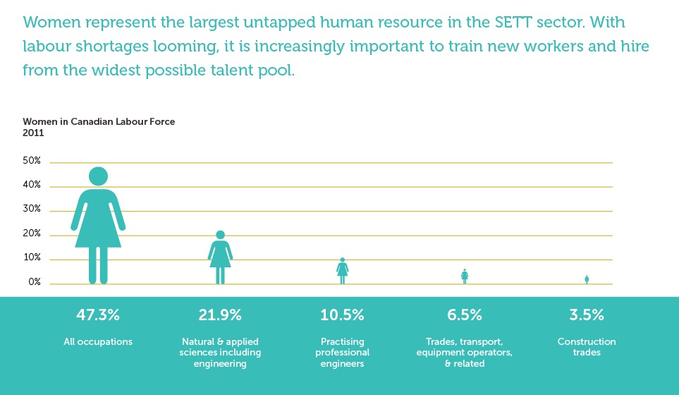
Infographics don’t need to be complicated – they just need to be well designed.