

Kerning vs. Tracking

Kerning in the digital world is the addition or reduction of space between a pair of characters to improve the overall balance and consistency of the spacing. Most well-designed typefaces include kerning pairs so that the type is beautifully set without too much additional work on the part of the designer.
Tracking is the addition or reduction of spacing between a whole range of characters. This can be used to improve the overall spacing of a font at a particular size, or to create the appearance of a more open, letterspaced look, usually reserved for short all-cap headings. Many running heads in books are set in all caps with extra tracking added.
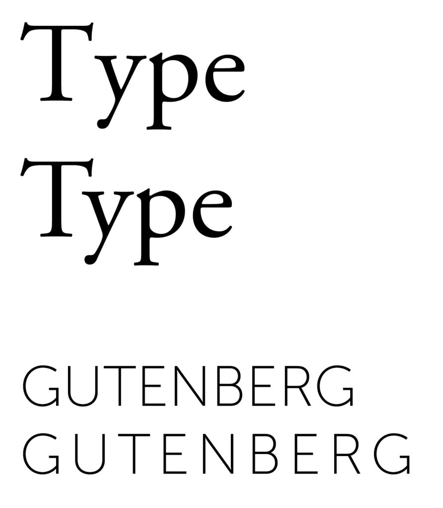
Top: Kerning – note the space between the T and Y. The second line is the correct way to set type. Bottom: Tracking – space has been added universally around all the characters of the word.
