

Comic Sans
I love to travel, and I find the joy is in the planning and researching for the upcoming trip. I am a self-confessed guidebook junkie – I get as many as I can from the library to do the initial research and then decide on which to purchase. Easy.
As a graphic designer with one guidebook under my belt (Edinburgh: Celebrity City Guide), I am swayed not only by the contents, but how the book looks and functions. Are the margins wide enough or do I have to literally crack the spine to read the text in the inside gutter? Is it easy to find sections and sub-sections? Are the maps easy to read and can I find specific references to museums, historical building, and restaurants? Does the book have colour photos? What type of paper is used? Is the index useful? Typeface choice is particularly important when it comes to guide books and maps, as often there is a lot of content being squeezed into tiny spaces.
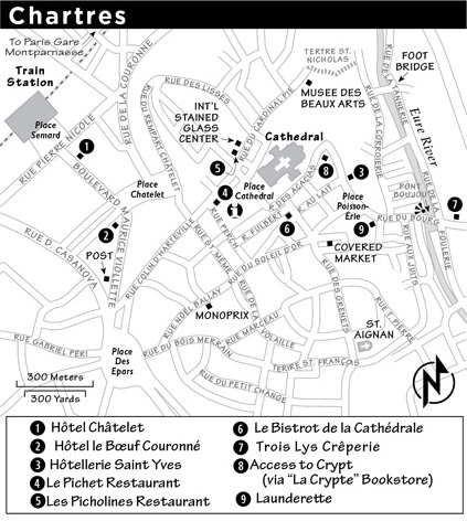
Enter Rick Steves – the author of many European travel guidebooks. His guidebooks have wonderful content – written in his candid humorous style. His maps unfortunately use a close relative to Comic Sans for all the map text. Comic Sans is classified as a casual, non-connecting script for use in informal documents inspired by comic book lettering. It has a childlike appearance and is often misused. I guess Rick wants to get across the idea that travelling is fun. But I shudder to think what a map of a European WWII site would look like all set in Comic Sans. Not so funny.
So, Rick, if you want me to purchase your travel guides, please change your typeface.
